7 One-Page Checkout Examples & The Psychology Behind Them
Level Up Today!
Book a DemoYour checkout page is the most valuable real estate on your entire website. It’s the final step where a visitor becomes a customer, and even small improvements can have a massive impact on your bottom line. The single most effective way to improve conversions is by implementing a one-page checkout. This guide is a deep dive into how and why it works so well. We'll cover the essential features, the psychological nudges that encourage a purchase, and the common mistakes you need to avoid. Everything will be illustrated with real-world one-page checkout examples that you can learn from and apply to your own store today.
Key Takeaways
- Streamline the Final Step: A one-page checkout is your best tool against cart abandonment. By putting all essential fields on a single, fast-loading page, you create a frictionless experience that respects your customer's time and makes it easier for them to complete their purchase.
- Prioritize Convenience and Clarity: A great checkout experience is both simple and flexible. Focus on a clean, mobile-first layout and offer essential conveniences like guest checkout, multiple payment methods, and smart forms with address autofill to remove any potential frustration.
- Earn Trust and Keep Optimizing: Reassure shoppers at the final moment with trust signals like security seals, transparent pricing, and clear return policies. From there, continuously A/B test your layout, button text, and offers to find what works best for your audience and steadily improve your conversion rates.
What is a One-Page Checkout? (And Why Should You Care?)
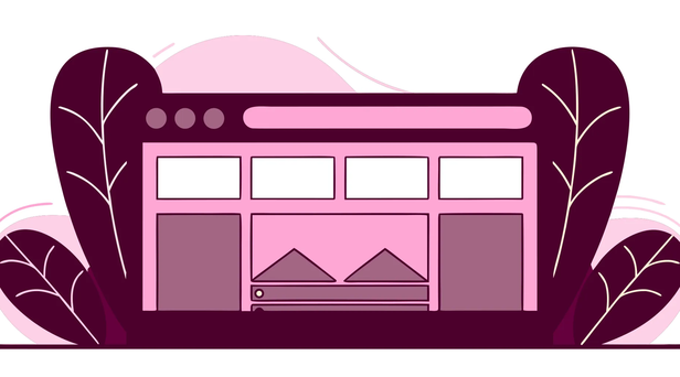
A one-page checkout is exactly what it sounds like: a single page where your customers can enter their shipping information, payment details, and confirm their order. Instead of clicking through multiple steps and waiting for new pages to load, everything they need to complete their purchase is right there in front of them.
This matters because every extra click and every second of load time is a chance for a customer to get distracted or frustrated and leave. A streamlined checkout process directly impacts your conversion rates and, ultimately, your revenue. It’s one of the most powerful ways to turn interested shoppers into happy customers by making the final step of their journey as simple as possible. By removing friction, you make it easy for people to give you their money.
One Page vs. Multiple Pages: What's the Difference?
The traditional multi-page checkout breaks the buying process into a series of steps. First, you enter your shipping info and click "Next." Then, you choose a shipping method and click "Next." Finally, you enter your payment details and click "Buy." Each step is a new page load and another opportunity for a customer to second-guess their purchase or simply run out of patience.
In contrast, a one-page checkout consolidates all these fields onto a single, streamlined page. Customers can see their cart summary, type in their address, and select a payment option without ever leaving the screen. It presents the entire transaction at a glance, giving shoppers a clear and quick path to completion.
The Goal: A Frictionless Buying Experience
The ultimate goal of a one-page checkout is to create a frictionless buying experience. By putting everything a customer needs on one screen, you remove unnecessary steps and mental hurdles. This focused design minimizes distractions, keeping the shopper’s attention on the single task of completing their purchase. It makes the process feel faster and more intuitive, which is especially important for mobile shoppers who value speed and simplicity. A seamless checkout shows customers you respect their time, building trust and encouraging them to finalize their order without hesitation. This is a core principle of effective conversion and AOV optimization.
How a Single Page Checkout Increases Conversions
When a customer decides to buy, your goal is to make the path from cart to confirmation as smooth as possible. Every extra click, page load, or unnecessary form field is a potential roadblock where you can lose a sale. A single-page checkout is designed to clear that path. By consolidating all the necessary steps into one clean interface, you create a more intuitive and efficient experience for your customers. This streamlined approach directly addresses the most common points of friction in the buying process, leading to higher conversion rates and a healthier bottom line.
Reduce Cart Abandonment
Cart abandonment is one of the biggest challenges for any online store, and a complicated checkout is often the primary culprit. When customers have to click through multiple pages to enter their shipping, billing, and payment information, they have more time to second-guess their purchase or simply get frustrated and leave. A one-page checkout puts all the essential steps on a single, easy-to-follow page. This design makes the process feel faster and requires less commitment from the shopper. By minimizing the number of steps, you reduce the chances of a customer dropping off before completing their order, which is a core principle of effective conversion and AOV optimization.
Simplify the Path to Purchase
Think about the last time you had a truly great online shopping experience. It probably felt effortless, right? That’s the feeling a one-page checkout creates. When all the information a customer needs is presented in one place, it reduces their cognitive load. They don't have to remember details from previous pages or wonder how many more steps are left. Everything from the order summary to payment options is visible at a glance, making the entire process feel transparent and straightforward. This simplicity builds trust and gives customers the confidence to click "buy now" without hesitation, turning a potentially complex task into a quick and easy transaction.
Perfect the Mobile Checkout
With more people shopping on their phones than ever before, a mobile-friendly checkout is non-negotiable. Tapping through multiple pages on a small screen is clunky and can lead to high abandonment rates. Single-page checkouts are naturally suited for mobile devices because they create a single, scrollable view. Customers can easily move through the shipping, payment, and review sections without waiting for new pages to load. A well-designed one-page checkout combines all the necessary fields in a clear, responsive layout that looks great on any screen. Using a powerful website builder ensures this experience is seamless, providing a consistent and user-friendly process for every shopper, no matter their device.
One-Page Checkout Examples That Convert
Theory is great, but seeing these principles in action is even better. The best way to understand what makes a one-page checkout work is to look at real-world examples that successfully guide customers from cart to confirmation. While every brand has a unique audience, certain layouts have proven to be effective across the board because they are built on a solid foundation of user experience psychology. They prioritize clarity, speed, and trust, which are universal desires for any online shopper. A well-designed checkout isn't just a form; it's the final, crucial conversation you have with your customer, and its design can make or break a sale.
Below, we’ll explore five powerful one-page checkout designs. Each one takes a slightly different approach to creating a frictionless path to purchase. From all-in-one platforms that handle the heavy lifting to clever layouts that reduce visual clutter, these examples will give you actionable inspiration for your own checkout page. Think of these not as rigid templates, but as starting points to test and tailor to your specific customers. By understanding the "why" behind each design, you can make more informed decisions and build a checkout experience that truly converts.
Checkout Champ: The All-in-One Solution
The ideal one-page checkout places all essential steps, from cart summary to payment, onto a single, streamlined page. This approach removes the need for customers to click through multiple screens, which reduces friction and keeps the momentum going. Instead of building this from scratch, an all-in-one platform like Checkout Champ provides a fully optimized, one-page checkout right out of the box. It’s designed for high conversion and AOV optimization by integrating every element, including payment processing, shipping details, and order summary, into one cohesive and intuitive interface. This lets you focus on your business while your checkout works hard to turn shoppers into customers.
The Collapsible Accordion
If your checkout process requires several distinct sections, the collapsible accordion is a fantastic way to present them without overwhelming the customer. This design organizes information into sections (like "Shipping Details" or "Payment Information") that expand when clicked and collapse when completed. By hiding fields until they are needed, you make the page appear much shorter and more manageable. This simple design trick can significantly improve the user experience by reducing cognitive load. It gives customers a sense of progress and control as they complete one section at a time, making the entire process feel faster and less like a chore.
The Single-Column Flow
A single-column layout is one of the most effective designs, especially for mobile shoppers. It creates a clear, logical path for the user to follow from top to bottom, eliminating any confusion about what to fill out next. This linear flow guides the eye downward in a natural reading pattern, preventing users from getting distracted or missing a required field. Because so many people shop on their phones, a responsive, single-column design ensures the experience is seamless on any screen size. It’s a simple, clean, and highly effective way to keep your customer focused on the single most important goal: completing their purchase.
The Two-Column Split
For desktop users, a two-column split can be a powerful layout. This design typically places the shipping and payment forms on the left side while keeping a persistent order summary on the right. The major advantage here is transparency. Customers can see their items, discounts, and the total cost at all times as they fill out their information. This constant reassurance helps prevent last-minute anxiety about hidden fees and keeps them focused on the value of their purchase. This checkout page design builds trust by keeping all the important details in plain sight, right where the customer needs them.
The Express Checkout
The fastest checkout is the one customers barely have to fill out. By offering express checkout options at the top of your page, you cater to shoppers who prioritize speed and convenience. Digital wallets like Apple Pay, Google Pay, or PayPal allow customers to complete their purchase with just a few clicks, using saved information. This is a must-have for encouraging repeat business, as it lets returning customers skip the tedious process of re-entering their address and payment details. Placing these familiar and trusted digital wallet buttons prominently can dramatically shorten the path to purchase and capture sales from customers who are ready to buy now.
Essential Design Principles for Your Checkout Page
A high-converting one-page checkout isn’t just about what you include; it’s about how you present it. The design of your checkout page can make the difference between a completed sale and an abandoned cart. Think of it as the final conversation you have with your customer. You want it to be clear, reassuring, and incredibly simple. By focusing on a few core design principles, you can create a seamless experience that guides shoppers to the finish line without any friction. These aren't just aesthetic choices; they are strategic decisions that directly impact your bottom line and are a key part of any conversion optimization strategy. Let’s walk through the four design pillars that every successful one-page checkout is built on.
Create a Clear Visual Hierarchy
Visual hierarchy is about arranging elements on the page to guide your customer’s attention naturally. When someone lands on your checkout, they should instantly understand the flow: where to enter their shipping details, how to select a payment method, and where to review their order. A well-organized page combines the cart summary, payment options, and address fields in a clear, intuitive way. You can achieve this by using headings, logical groupings for form fields, and white space to separate different sections. The goal is to create a predictable path that requires zero guesswork, making the entire process feel effortless.
Go for a Minimal, Distraction-Free Layout
The checkout page has one purpose: to finalize a purchase. Anything that doesn't support that goal is a potential distraction. A minimal, clean layout helps shoppers focus on completing their order. By keeping everything on one page, you reduce what experts call "cognitive load," which makes it easier for customers to process information and make decisions. To create a distraction-free environment, remove your website’s main navigation menu, promotional banners, and any unnecessary links from the checkout page. This simple change keeps the customer on task and moving toward that final "Complete Order" button.
Design for Mobile First
With a huge number of people shopping on their phones, a mobile-friendly checkout is non-negotiable. A "mobile-first" approach means you design the experience for the smallest screen first and then adapt it for larger devices. This ensures your checkout is seamless for everyone, regardless of how they shop. For mobile users, this means large, easy-to-tap buttons, readable text, and form fields that are simple to fill out on a small keyboard. A single-column layout is almost always the best choice for mobile, as it eliminates the need for frustrating pinching and zooming.
Keep Your Branding Consistent
When a customer clicks "Checkout," they are moving to the most sensitive part of the transaction. This is where trust is critical. A checkout page that looks completely different from the rest of your store can feel jarring and untrustworthy, causing shoppers to hesitate. Maintaining consistent branding, as noted by the Webflow Blog, reinforces familiarity and reassures customers they are still in the right place. Use your brand’s logo, colors, and fonts to create a cohesive experience. This small detail tells customers that their purchase is secure and that they are buying directly from you.
Must-Have Features for Your One-Page Checkout
A clean design is the foundation of a great checkout page, but the features you build into it are what truly seal the deal. The right combination of options can make the difference between a customer who clicks "buy" and one who abandons their cart. Think of these features as the friendly guide that helps your customer cross the finish line with confidence. By focusing on convenience, transparency, and smart suggestions, you can create a checkout experience that feels less like a chore and more like the final, satisfying step of their purchase.
Offer Guest Checkout & Express Payments
Forcing a customer to create an account before they can buy is one of the fastest ways to lose a sale. Many shoppers, especially on mobile, are in a hurry and don’t want the hassle of remembering another password. Offering a guest checkout option removes this major point of friction. You can always invite them to create an account on the confirmation page after the sale is complete. Take it a step further by integrating express payment options like PayPal, Apple Pay, or Google Pay. These digital wallets allow customers to complete their purchase with just a click or a fingerprint, using pre-filled shipping and payment information. It’s the ultimate convenience and a must-have for a truly seamless checkout.
Include Multiple Payment Methods
Customers expect flexibility when it comes to paying for their orders. While credit and debit cards are standard, limiting your options to just that can alienate a significant portion of your audience. A high-converting checkout page should offer a variety of payment methods to suit different preferences. This includes popular digital wallets and the increasingly popular "Buy Now, Pay Later" (BNPL) services like Klarna or Afterpay. Providing these choices shows that you understand your customers' needs and can significantly reduce cart abandonment. It also helps build trust by letting people pay with the method they feel most secure using.
Use Smart Forms with Autofill
No one enjoys typing their address into a form, especially on a small phone screen. Smart forms are designed to make this process as painless as possible. Start by only asking for the information you absolutely need to process the order. Then, use features like address autofill, which suggests verified addresses as the customer starts typing. This not only saves time but also reduces the chance of shipping errors caused by typos. The goal is to minimize the effort required from the customer. The less they have to type, the more likely they are to complete their purchase without frustration.
Show a Clear Order Summary
Surprises are the enemy of a smooth checkout. Customers want to feel confident and in control of their purchase, so a clear and persistent order summary is essential. Throughout the checkout process, display a simple breakdown of what’s in their cart, including product images, names, quantities, and prices. Make sure to clearly itemize all costs, such as the subtotal, shipping fees, and taxes, so the final price is transparent. This constant reassurance confirms they’re buying the right items and prevents the last-minute shock of unexpected fees, which is a major reason people abandon their carts.
Add Strategic Upsells & Cross-sells
The checkout page is the perfect place to increase your average order value (AOV) with relevant offers. Instead of treating it as a simple transaction, view it as a final opportunity to help your customer. You can offer a strategic upsell, like an extended warranty, or a cross-sell of a complementary product, like batteries for an electronic toy. To make these offers more compelling, pair them with social proof like customer reviews. Checkout Champ’s tools for conversion and AOV optimization can help you seamlessly integrate these offers without disrupting the customer’s journey, making it a win-win for both of you.
Psychological Nudges That Encourage a Purchase
Once you’ve perfected the layout and features of your checkout page, you can add a few psychological touches to guide customers toward completing their purchase. This isn’t about being manipulative; it’s about understanding human behavior and using that knowledge to make the buying process feel safer, easier, and more intuitive. Think of these as small, helpful signposts that address a customer’s unspoken questions and anxieties right when they arise.
When a shopper is about to enter their payment information, they might be wondering, "Is this a good deal?" or "Can I trust this website?" By strategically placing elements that build confidence and create a sense of positive momentum, you can answer these questions before they become reasons for cart abandonment. These nudges work because they tap into fundamental drivers of decision-making, like trust, urgency, and the desire for a clear path forward. Integrating them into your checkout flow shows customers you’ve considered their experience from start to finish, which is a key part of building a loyal customer base. Checkout Champ’s conversion optimization tools are designed to help you implement these strategies seamlessly, turning potential hesitation into confident clicks.
Build Trust with Social Proof and Security Seals
When a customer is on the verge of buying, their trust is on the line. They need to feel confident that their personal and financial information is safe. This is where social proof and security seals come in. Displaying customer reviews, star ratings, or short testimonials directly on the checkout page reminds them that other people have had positive experiences. Similarly, visible security badges from McAfee or Norton, along with logos of trusted payment providers like Visa and PayPal, provide immediate visual reassurance. These elements act as a digital seal of approval, calming last-minute jitters and confirming that they’re making a smart, secure choice.
Create Urgency with Scarcity
Urgency is a powerful motivator. When customers feel that a product they want might soon be unavailable or that a special offer is about to expire, they are more likely to act quickly. You can create this sense by adding simple messages like "Only 2 left in stock!" or a countdown timer for a limited-time discount. This approach taps into fundamental psychological principles related to scarcity, encouraging shoppers to complete their purchase now rather than putting it off for later. The key is to be genuine; use real inventory data or time-based offers to build excitement without creating a false sense of pressure.
Show a Progress Bar
No one likes to feel stuck in a process without knowing when it will end. A progress bar is a simple but effective visual tool that manages customer expectations during checkout. By breaking the process into clear, labeled steps (like Shipping, Billing, and Confirmation), you show customers exactly where they are and how much is left to do. This makes the entire experience feel more manageable and less overwhelming, especially on mobile devices. Seeing that they’re already halfway through encourages them to push through to the final step, reducing the chances they’ll give up out of frustration or impatience.
Use Reassuring Language and Guarantees
The words you use on your checkout page matter. Simple, reassuring language can make a huge difference in a customer’s mindset. For example, labeling a button "Continue to Secure Payment" is more comforting than just "Continue." Beyond that, prominently displaying your guarantees removes perceived risk. A clear "30-Day Money-Back Guarantee" or a "Hassle-Free Returns" policy tells customers they have a safety net. This assurance can be the final nudge someone needs to overcome their hesitation and confidently click the "Complete Purchase" button, knowing they have nothing to lose.
How to Optimize Your One-Page Checkout
Once you’ve designed your checkout page, the work isn’t over. The best checkout experiences are the result of continuous testing and refinement. Even small adjustments can have a surprisingly large impact on your conversion rates and revenue. Think of your checkout page as a living part of your store that evolves with your customers' needs.
By focusing on a few key areas, you can fine-tune your page to create a seamless path to purchase. This process is all about removing friction, building trust, and making it as easy as possible for a shopper to click "complete order." Let's walk through the most effective ways to optimize your one-page checkout.
A/B Test Your Layout and CTAs
You can follow every best practice in the book, but the only way to know what truly works for your specific audience is to test it. A/B testing involves showing two different versions of your checkout page to different segments of your audience to see which one performs better. Making small changes can lead to significant gains in sales. You can test everything from the color of your call-to-action (CTA) button to the text on it, like "Buy Now" versus "Complete Purchase." You could even test a single-column layout against a two-column one. A platform with strong analytics and reporting is essential for tracking these results accurately.
Remove Distracting Navigation
The goal of your checkout page is to get the customer to complete their purchase. Anything that could pull their attention away from that single task is a potential conversion killer. By keeping everything on one page, you create a focused environment that guides the shopper toward the finish line. Remove your website’s main navigation menu, promotional banners, and any non-essential footer links. A streamlined checkout process with fewer distractions minimizes the chances of cart abandonment. The only clickable options should be those that move the customer forward, like proceeding to payment or completing the order.
Prioritize Page Speed
In ecommerce, every second counts. Customers are not known for their patience, and a slow-loading page is one of the fastest ways to lose a sale. Since there's only one page to load, one-page checkouts often load quicker, which is a great starting point. However, you still need to ensure it’s optimized for speed. Compress any images on the page, such as trust seals or product thumbnails, and choose a checkout solution built for performance. A fast, responsive page keeps customers engaged and reduces the likelihood they’ll give up before finalizing their purchase.
Use Smart Error Handling
Mistakes happen. A customer might mistype their email or enter an invalid credit card number. How your checkout page handles these errors can make the difference between a completed sale and a frustrated, lost customer. Smart forms with autofill and instant error checks create a much smoother experience. Instead of showing a generic error message after the customer hits submit, highlight the specific field with the problem and provide a clear, helpful message. For example, "Please enter a valid ZIP code." This reduces frustration and helps shoppers correct mistakes quickly, which is a core part of any good conversion optimization strategy.
Common One-Page Checkout Mistakes to Avoid
A single-page checkout is a fantastic start, but it’s not a magic wand. A few common missteps can still create friction and send potential customers running for the virtual exit. The goal is to make buying from you feel effortless, and that means paying close attention to the details. Getting your checkout page right involves more than just putting all the fields on one screen; it’s about removing every possible obstacle between your customer and that final "Complete Purchase" click. By sidestepping these common mistakes, you can ensure your streamlined checkout actually delivers the conversion lift you’re looking for.
Asking for Too Much Information
Think of your checkout form like a conversation. If you ask too many personal questions too quickly, it feels invasive and exhausting. Every extra field you require is another reason for a customer to abandon their cart. Stick to the essentials: name, shipping address, and payment details. Do you really need their phone number if you're not using it for shipping updates? Is a mandatory account creation step scaring people away? Streamline your forms by asking only for what is absolutely necessary to process the order. Features like address autofill can also save customers precious time and reduce typos, making the entire process feel smoother and more respectful of their effort.
Adding Unexpected Costs at the End
There’s nothing that sours a purchase faster than sticker shock. A customer might be thrilled with their cart total, only to be hit with surprisingly high shipping fees and taxes on the final step. This is one of the top reasons for cart abandonment. The fix is simple: be transparent from the start. Show all costs, including shipping and taxes, upfront in the order summary. Use a real-time shipping calculator or offer flat-rate shipping options so there are no surprises. When customers feel like you’re being honest and upfront about the total cost, they build trust in your brand and are far more likely to follow through with their purchase.
Hiding Customer Support
When a customer is about to give you their money, they might have a last-minute question about shipping, a promo code, or a product detail. If they can’t find an answer quickly, they’re likely to leave your site to search for it, and they may not come back. Make it incredibly easy for customers to get help without leaving the checkout page. A visible live chat widget, a clear phone number, or a link to a concise FAQ section can make all the difference. Providing accessible customer support at this critical moment shows you’re there to help, reassuring them and guiding them toward completing the sale.
Forgetting About Mobile Users
A significant portion of your customers are shopping on their phones, often while on the go. A checkout page that isn’t designed for a small screen is a guaranteed conversion killer. Pinching and zooming to fill out forms is frustrating and leads to errors. Your one-page checkout must be built with a mobile-first approach. This means large, easy-to-tap buttons, form fields that are simple to select, and a layout that requires minimal scrolling. Integrating digital wallets like Apple Pay and Google Pay is also a game-changer for mobile users, allowing them to complete their purchase with just a tap instead of manually typing in their card details.
Related Articles
Frequently Asked Questions
Is a one-page checkout always the best choice for every store? For the vast majority of online stores, a one-page checkout is the superior option because it significantly reduces friction and cart abandonment. However, for businesses with very complex orders that might require custom shipping quotes or detailed personalization steps, a multi-step process can sometimes help manage customer expectations. The key is to test what works for your specific audience, but a streamlined single page is almost always the best place to start.
Won't putting everything on one page make it look long and intimidating? That's a common concern, but it's easily solved with smart design. A long page isn't a problem as long as it's well-organized and easy to follow. Using a clean, single-column layout creates a clear path for the customer, while techniques like collapsible accordion sections can group information neatly. This keeps the page looking manageable and guides the shopper through each step without overwhelming them.
How can I still encourage customers to create an account if I offer guest checkout? Offering a guest checkout is essential, but you don't have to give up on account creation. The best time to ask is on the order confirmation page, right after the purchase is complete. At this point, the customer has already given you their information. You can simply offer them the option to save their details for next time by creating a password. It feels like a helpful suggestion rather than a mandatory hurdle.
Do I need to be a developer to switch to a one-page checkout? Not at all. While you could build a custom solution, all-in-one e-commerce platforms are designed to handle this for you. A solution like Checkout Champ provides a fully optimized, one-page checkout right out of the box. This lets you get all the conversion benefits without needing to write a single line of code, so you can focus on running your business.
What's the single biggest mistake to avoid when designing a checkout page? The most damaging mistake is surprising your customer with unexpected costs at the very end. High shipping fees or taxes that only appear after they've entered all their information is the number one reason people abandon their carts. Be completely transparent about the total cost from the beginning by showing a clear, itemized order summary that updates as they fill out their details.