Why Customers Skip Shopify Upsells & How to Fix It
Level Up Today!
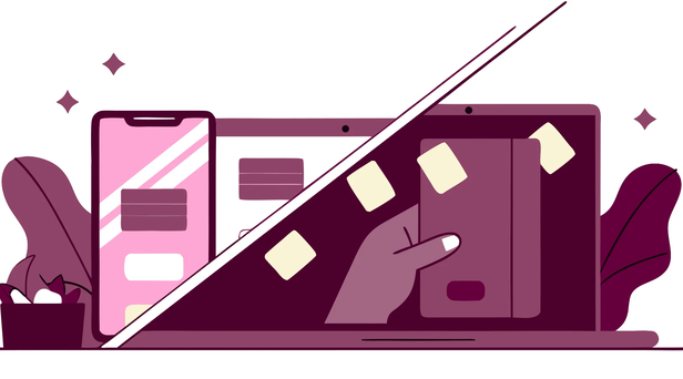
Book a DemoThink about the last time you were shopping online and an offer popped up that felt completely random. You probably closed it without a second thought. Your customers are doing the same thing. If your upsells are falling flat, it’s time to step into your shoppers' shoes and ask the critical question: "Why do some customers skip my upsells entirely in Shopify?" The answer often lies in the overall user experience. A slow-loading page, a confusing layout, or a checkout process full of friction can annoy customers long before they even see your offer. This guide will show you how to identify and fix these experience gaps.
Key Takeaways
- Focus on trust before the upsell: Customers won't spend more if they don't feel secure with their first purchase. Solidify your store's credibility with clear social proof, a simple return policy, and professional product presentation to make shoppers feel confident saying yes.
- Present the right offer at the right time: An effective upsell feels like a helpful suggestion, not a sales pitch. Make your offers highly relevant by personalizing them to the customer's cart and present them at key moments, like on the product page or immediately after purchase, to avoid friction.
- Stop guessing and start testing: Use your store's data to understand what truly works. Track key metrics like average order value, A/B test different offers and designs, and analyze where customers leave your site to make smart, data-backed improvements to your upsell strategy.
Why Your Shopify Upsells Aren't Working
You’ve set up your upsell funnels and are ready to see your average order value climb, but the results are falling flat. It’s a common frustration. Often, the problem isn’t the upsell itself, but the strategy behind it. When customers consistently ignore your offers, it’s a sign that something in your approach is off. Before you scrap your efforts entirely, let’s look at a few common reasons why your upsell offers might not be connecting with your customers and what you can do to fix them.
Your Timing is Off
Timing is everything, especially in sales. If you present an upsell before a customer even trusts your brand, it can feel pushy and premature. Think about it: if someone is still on the fence about making their first purchase, asking them to spend even more is a big ask. If your store’s overall conversion rate is low, you likely have a trust issue to solve first. Focus on the fundamentals, like showcasing real customer reviews and being transparent about your brand. Boosting buyer confidence with these signals builds the foundation you need for upsells to succeed later on. Once a customer trusts you, they’ll be much more receptive to your recommendations.
The Offers Don't Make Sense
A successful upsell feels like a helpful suggestion, not a random sales pitch. The key is relevance. An effective upselling strategy presents a customer with a logical upgrade or a better version of the product they’re already interested in. For example, if a customer adds a 16-ounce bottle of shampoo to their cart, offering them a 32-ounce bottle for a better value makes perfect sense. However, trying to sell them a completely unrelated product will likely just cause confusion. Your offer should clearly enhance their original purchase, making them feel like they’re getting an even better deal or a more complete solution to their problem.
You're Showing Too Many Offers
It’s tempting to present customers with multiple options, hoping one will stick. Unfortunately, this approach often backfires. Bombarding shoppers with too many choices leads to decision fatigue, where they feel so overwhelmed that they choose nothing at all. Instead of improving your AOV, you might just annoy them into abandoning their cart. A better approach is to be strategic and selective. Monitor how your offers impact the overall customer experience and focus on presenting just one or two highly relevant upsells. A clean, simple checkout process with a single, compelling offer is far more effective than a cluttered page full of distractions.
Does Your Store Feel Trustworthy?
Before a customer even considers an upsell, they have to feel confident about their initial purchase. Think about it: if someone is already a little hesitant to buy from you, why would they agree to spend even more? Trust is the foundation of every sale, and it’s especially critical when you’re asking for a bigger commitment. An upsell offer can feel like a great deal or a pushy sales tactic, and the difference often comes down to how trustworthy your store feels. This isn't just about having a secure checkout; it's about the small signals you send on every page that tell customers, "You're in good hands." If your upsells are falling flat, it might be time to check if you’re building that essential confidence with shoppers.
You Lack Social Proof
When a customer sees an upsell offer, they have to make a split-second decision. If they’re already on the fence, they’ll likely say no. This is where social proof comes in. Customer reviews, ratings, and testimonials are like a friend whispering, “I bought this, and it’s great.” These trust signals are powerful because they reduce buyer anxiety right at the moment of decision. If a shopper sees that hundreds of other people have purchased and loved a product, they feel much more secure in their choice. Don’t just keep reviews on your product pages; feature them near your upsell offers to give customers that final nudge of confidence they need to click “add to cart.”
Your Return Policy is Confusing
Every online purchase comes with a small amount of risk for the customer. What if it doesn’t fit? What if it’s not what they expected? A clear, simple return policy acts as a safety net, removing that risk and making it easier for them to say yes. If your policy is hard to find or filled with complicated legal language, it can make your store seem untrustworthy. Research shows that placing your return policy near the "Add to Cart" button can significantly improve conversions. When a customer is considering an upsell, seeing a hassle-free return guarantee makes the decision to spend a little extra feel much safer. Make your policy easy to understand and impossible to miss.
You're Missing Secure Payment Badges
In a world of data breaches, customers are rightly concerned about their payment security. Secure payment badges from providers like Visa, Mastercard, and PayPal are visual cues that tell shoppers their information is safe. However, where you place them matters more than you might think. Many stores tuck these badges away in the footer, but their real power is unlocked when they’re placed near your call-to-action buttons. Placing a security badge just above your "Complete Purchase" or "Accept Offer" button reassures customers at the exact moment they might feel a flicker of anxiety. It’s a small change that reinforces the security of your entire platform, especially if you handle recurring payments through subscription billings.
How Your Product Presentation Kills Conversions
Think of your product page as your digital salesperson. If it looks sloppy or doesn't communicate value, customers will walk away before you even get a chance to suggest an add-on. The way you present your products directly impacts how much a customer trusts your brand and sees value in what you offer. A weak presentation makes your entire store feel less credible, causing shoppers to question everything from product quality to the legitimacy of your upsell offers. Before you can successfully upsell anyone, you have to nail the first impression.
When a customer lands on a product page that feels thrown together, their internal alarm bells start ringing. They wonder if the business is legitimate or if the product will live up to its promises. This hesitation is a conversion killer. If they don't trust the primary product you're showing them, they certainly won't trust an additional item you suggest. Polishing your product presentation isn't just about making things look pretty; it's about building the foundational trust required for a customer to not only make a purchase but also be receptive to further suggestions.
Your Descriptions Don't Sell the Value
A product description that just lists specs and features is a missed opportunity. Customers don't buy features; they buy better versions of themselves. Your description needs to paint a picture of how your product solves a problem or improves their life. Instead of just saying a backpack is "water-resistant," describe the peace of mind they'll have knowing their laptop is safe during a sudden downpour. Explain the benefits clearly and tell a story that helps the shopper visualize themselves using and loving your product. You can use a good product management system to easily update and enrich your descriptions across your entire catalog, ensuring every item sells a solution, not just an object.
Your Images and Videos Look Unprofessional
In online shopping, your photos and videos do all the heavy lifting. Since customers can't physically touch or inspect your products, high-quality visuals are non-negotiable. Blurry, dark, or inconsistent images can make even the best products look cheap and cause shoppers to doubt your store's credibility. Your site will look more polished and trustworthy when you use a professional website builder that showcases your visuals effectively. Invest in clear, well-lit photos from multiple angles. Include lifestyle shots showing the product in use and consider adding a short video to demonstrate its features and quality. This helps customers feel confident in their decision and more open to additional offers.
The Price Doesn't Feel Like a Good Deal
The price tag itself is only part of the equation; the real driver is perceived value. Does your offer feel like a steal, or does it feel like a stretch? You can frame your pricing to feel more attractive by creating a sense of urgency or adding extra value. Highlighting limited stock (“Only 3 left!”) can encourage immediate action. Offering free shipping, a first-time buyer discount, or bundling products together can make the total cost feel more reasonable. When the initial purchase already feels like a great deal, customers are far more likely to see an upsell as another opportunity to win, not as a pushy sales tactic. This is a core part of conversion optimization that builds goodwill from the start.
Is Your User Experience Working Against You?
Sometimes, the reason an upsell fails has nothing to do with the offer itself. Instead, the problem lies with the overall shopping experience. If your store is frustrating to use, customers won't be in the mood to consider adding more to their cart. They’re focused on one thing: getting through the checkout process as quickly as possible before something else goes wrong. Think of it like this: if you’re in a crowded, noisy, and confusing store, you just want to grab what you need and leave. You’re not going to stop and browse the nice display by the register.
Friction is the enemy of conversion. Every obstacle, delay, or moment of confusion in the customer journey wears down a shopper's patience and trust. By the time they see your upsell offer, they might already be annoyed. A clunky user experience can make your perfectly crafted offer feel like just another hurdle to jump over. Before you can successfully implement advanced sales strategies, you have to nail the fundamentals. Let's look at a few common user experience issues that might be sabotaging your upsells.
Your Checkout Pages are Too Slow
We’ve all been there: you click "buy now" and are met with a loading wheel that seems to spin forever. Page speed is critical, especially during checkout. Research shows that "a slow-loading store, jerky animations, or slow 'add to cart' buttons will make customers leave." A slow page doesn't just test a customer's patience; it creates anxiety and erodes trust. Shoppers start to wonder if the site is secure or if their payment information is safe.
When an upsell offer appears on a page that’s already lagging, it feels like an interruption, not an opportunity. Instead of considering the value, the customer’s immediate reaction is to click "no" just to speed things up. Optimizing your store for faster load times is a foundational step for better conversion and AOV optimization.
The Layout is Cluttered and Confusing
A clean, intuitive layout guides your customers smoothly from browsing to buying. If your store is a chaotic jumble of text, images, and pop-ups, you’re creating unnecessary work for your shoppers. It’s essential to "make your menu easy to use" and "group products logically" so people can find what they’re looking for without getting frustrated. When customers have to hunt for the "Add to Cart" button or struggle to understand your site's navigation, they experience decision fatigue.
By the time they finally reach the checkout, their patience is already thin. An upsell offer presented in a cluttered interface just adds to the visual noise. To give your upsells a fighting chance, you need a clean design. Using a flexible website builder can help you create a streamlined experience that makes shopping feel effortless.
It's Not Optimized for Mobile Users
Take a look at your analytics, and you'll likely confirm that "most people shop on their phones." This means your store absolutely must "look and work great on mobile devices." An experience designed for a desktop screen often translates poorly to mobile, resulting in tiny text, buttons that are too close together, and endless scrolling. If a customer has to pinch and zoom just to read a product description or accurately tap a button, they are not having a good time.
This frustration builds with every tap and swipe. When they finally see your upsell offer, they’re more likely to dismiss it out of annoyance than to consider the deal. A seamless mobile experience isn't a bonus feature anymore; it's a requirement for a successful ecommerce store.
What Makes an Upsell Offer Easy to Ignore?
An effective upsell should feel like a helpful suggestion, not a pushy sales pitch. If your customers are consistently clicking past your offers, it’s a sign that something is missing. Usually, the problem isn’t the product itself, but the way it’s presented. Let’s break down the common reasons why an upsell gets ignored and how you can make your offers more compelling.
The Offer Feels Generic
Customers can spot a one-size-fits-all offer from a mile away. When an upsell has no connection to what they’re already buying, it feels impersonal and irrelevant. Think about it: you wouldn’t offer a leather care kit to someone buying a vegan handbag. Generic offers show you aren’t paying attention to your customer’s needs. Instead, use what you know about their cart and purchase history to present a logical next step. By using marketing automation to create personalized suggestions, you show customers you understand them, which builds trust and makes the upsell feel like a genuine recommendation.
Your Call to Action is Vague
Your call to action (CTA) is the final step, so it needs to be crystal clear and persuasive. A button that just says “Add” or “Upgrade” is functional, but it doesn’t create any excitement. Use specific, benefit-driven language that tells the customer exactly what they’re getting. For example, “Yes, Add the Matching Wallet & Complete My Set!” is much more effective than “Add to Cart.” Your CTA should also be easy to find and visually distinct. Placing trust signals, like a money-back guarantee, directly next to the CTA can also reduce last-minute hesitation and help with conversion optimization.
The Price Feels Like a Trap, Not a Deal
The goal of an upsell is to increase order value, but if the price jump feels too steep or unjustified, customers will get suspicious. The offer must feel like a smart decision, not a sneaky trick to get more money. Frame your upsell as an exclusive opportunity or a great deal. For instance, showing the value they get with a bundle or offering a small discount for upgrading on the spot makes the higher price feel worth it. Clearly communicating the added value is key to making the customer feel confident in their decision to spend a little more and is a great way of optimizing your average order value.
When to Upsell: Timing Strategies That Work
Knowing what to offer is only half the battle; knowing when to offer it is what seals the deal. The timing of your upsell can make the difference between a helpful suggestion and an annoying interruption. By placing your offers at the right moments in the customer journey, you can create a smoother experience that also improves your average order value. Let's walk through the three key moments to present an upsell and how to make each one count.
Offer Upsells Before Purchase
The best time to catch a customer’s attention is when they are actively considering a product. A pre-purchase upsell, shown directly on the product page, lets you present a better value proposition before they even click “add to cart.” This is your chance to offer a product bundle, an upgraded version, or a customization that enhances the original item. For example, you could show a premium leather case alongside a standard one.
To make this work, the offer needs to feel like an exclusive opportunity. You can frame it as a limited-time bundle or a special package deal. This creates a sense of urgency that encourages customers to make a decision on the spot. The key is to present a clear upgrade path that makes perfect sense for the item they’re already looking at, which is a core part of conversion and AOV optimization.
Add Upsells in the Cart
The shopping cart is a natural checkpoint where customers review their selections before committing to payment. This makes it an ideal spot for a small, relevant upsell. Think of it as the digital version of the candy rack at the grocery store checkout. You can suggest low-cost, high-value items like product protection, gift wrapping, or a popular accessory that complements what’s already in their cart.
The most important rule here is to avoid friction. The offer should appear seamlessly within the cart page, not as an aggressive pop-up that disrupts the checkout flow. A slow-loading or clunky offer will make customers abandon their purchase entirely. Your platform’s website builder should ensure this experience is smooth and integrated. Monitor how often customers accept these offers to refine what you show them over time.
Use Post-Purchase Upsells to Reduce Friction
A post-purchase upsell is one of the most effective and lowest-risk strategies you can use. This offer appears after a customer completes their initial purchase but before they land on the final thank you page. Since they’ve already entered their payment information, they can accept the new offer with a single click. This completely removes the friction of a second checkout process and protects your original sale.
This is the perfect moment for a "one-time offer" that feels like a special reward for their purchase. Because the customer has already committed, they are in a buying mindset and more open to an additional deal. When done well, a post-purchase upsell can significantly increase revenue and customer lifetime value. An all-in-one platform with powerful features makes it simple to manage this flow without any complicated technical workarounds.
How to Increase Your Upsell Conversion Rate
Fixing your upsells isn't just about avoiding mistakes; it's about actively creating offers your customers want to accept. When you shift your focus from just selling more to genuinely adding value, your conversion rate will follow. The key is to make your upsell feel like a helpful suggestion, not a pushy sales tactic. By personalizing recommendations, bundling products smartly, and building trust, you can turn a skipped offer into a bigger, better sale. Let's get into the specific strategies that make a real difference.
Personalize Your Product Recommendations
Generic upsells are easy to ignore because they feel irrelevant. Instead of showing every customer the same offer, tailor your recommendations based on what you already know about them. Presenting customers with products that align with their interests and previous purchases shows you understand their needs. This creates a more personal and enjoyable shopping experience. For example, if someone buys a camera, offer a compatible memory card or a camera bag, not a random bestseller. Using a platform with strong conversion and AOV optimization tools allows you to set up these smart rules, ensuring your upsells are always relevant and helpful.
Bundle Products to Add Value
Bundles work because they simplify the decision-making process and make the customer feel like they’re getting a great deal. Instead of just offering a single, more expensive item, try grouping related products together. You can create "starter kits," "complete the look" packages, or "build your own" bundles that give customers control. For instance, the beauty brand Florence by Mills used a quiz to create personalized bundles, which helped increase their average order value. This strategy makes the upsell feel less like an extra cost and more like a convenient, value-packed solution that enhances their original purchase.
Create Urgency with Time-Sensitive Offers
Creating a sense of urgency can be a powerful tool to encourage customers to accept an upsell. When an offer is only available for a limited time, it prompts a faster decision. This isn't about being deceptive; it's about motivating action on a genuinely good deal. You can add a countdown timer to your upsell pop-up with a message like, "Add this for 15% off in the next 10 minutes!" or "Limited stock available at this price." This simple tactic leverages the fear of missing out (FOMO) and can turn a "maybe later" into a "yes, now," especially for post-purchase upsells where the initial transaction is already complete.
Add Trust Signals to Your Upsell Offers
Even a great offer can fail if the customer feels hesitant. You need to reinforce trust at the moment you ask for more money. Adding trust signals directly to your upsell windows can make a huge impact. Include things like star ratings, a short customer testimonial, or a "Bestseller" badge next to the recommended product. These small elements provide social proof and reassure the customer that they're making a smart choice. A security badge placed near your call-to-action button can also remind them that their purchase is safe, reducing friction and making it easier to say yes.
Make It Easy to Accept or Decline
Your upsell's design is just as important as the offer itself. If it's confusing or difficult to interact with, customers will close the window without a second thought. The user experience should be seamless. Use a large, clear button to accept the offer, like "Yes, Add to My Order!" The option to decline should also be obvious, such as a simple "No, thank you" link. The goal is to make the interaction feel effortless. Monitoring how often customers accept your upsell offers and how these offers impact the overall experience is crucial for finding what works best for your store.
How to Use Data to Refine Your Upsell Strategy
Guessing what your customers want is a recipe for missed opportunities. Instead of throwing random offers at the wall to see what sticks, you can use data to make smart, effective decisions. When you let real numbers guide your strategy, you take the guesswork out of the equation and start building an upsell process that actually works. A great upsell strategy is a continuous loop of testing, learning, and refining. The right tools make this process simple, allowing you to see exactly what’s happening and why. By focusing on a few key areas, you can turn your data into your most powerful sales tool.
Track These Key Metrics
To understand if your upsells are hitting the mark, you need to watch a few key numbers. Start with your Average Order Value (AOV). If this number is going up, it’s a great sign your upsells are encouraging customers to spend more. Also, keep an eye on your Sales Conversion Rate to ensure your offers aren't accidentally scaring buyers away before they complete their purchase. Other important metrics include the Click-through Rate on your offers and the Shopping Cart Abandonment Rate. Powerful analytics and reporting tools can help you track these figures without getting lost in spreadsheets, giving you a clear picture of what’s working.
A/B Test These Elements in Your Offers
Once you know your numbers, you can start experimenting. A/B testing is simply trying two different versions of an offer to see which one performs better. You can test almost anything, but start with the elements that have the biggest impact. Try changing the wording of your offer, like testing "Frequently bought with" against "Upgrade your order." Experiment with the placement, seeing if an in-cart offer works better than a post-purchase pop-up. Even the design, like the color of your "Add to Cart" button, can make a difference. This process of continuous conversion and AOV optimization helps you make small changes that lead to significant gains over time.
Use Analytics to Find Where Customers Drop Off
Your analytics can tell you a story about your customer’s journey, including where they lose interest. If you notice a high bounce rate on a page with an upsell, the offer might be too distracting or irrelevant. A spike in your cart abandonment rate after an upsell is shown could mean the offer feels too aggressive or the value isn't clear. By digging into your data, you can pinpoint these specific drop-off points. Think of it as finding leaks in your sales funnel. Once you know where customers are leaving, you can adjust your upsell timing, messaging, or presentation to create a smoother path to checkout.
Fix Your Upsell Performance with Checkout Champ
Trying to fix every little thing that hurts your upsell conversions can feel like a game of whack-a-mole. You patch one problem, and another pops up. Instead of juggling dozens of apps and tweaks, you can streamline your entire process with a platform designed to solve these issues from the ground up. This is where Checkout Champ comes in. It replaces a clunky, multi-app setup with a single, powerful system for improving your customer's journey. Many upsell issues come down to a lack of trust and a poor user experience. If your checkout page is slow, confusing, or looks unprofessional, customers won't stick around for an extra offer. Research shows that implementing effective trust signals is one of the fastest ways to improve sales. Checkout Champ helps you build a fast, clean, and secure checkout experience that gives customers the confidence to complete their purchase and consider your upsell. You can easily add security badges, testimonials, and a clear layout that works perfectly on any device.
Beyond trust, the best upsell offers are frictionless. Instead of interrupting the initial purchase, you can present offers after the payment is already complete. Checkout Champ’s Conversion & AOV Optimization tools make this simple with one-click post-purchase upsells. Your customer can add another item to their order without having to enter their payment information again. You can also use the built-in Analytics & Reporting to see exactly where customers drop off, allowing you to refine your offers based on real data, not just guesswork. By combining a trustworthy experience with perfectly timed, low-friction offers, you create a system that makes it easy for customers to say yes.
Related Articles
Frequently Asked Questions
What's the single biggest mistake people make with upsells? The most common mistake is forgetting that an upsell needs to make sense for the customer, not just for your bottom line. Many store owners throw random, high-margin products at shoppers, which feels pushy and irrelevant. A successful upsell should feel like a helpful suggestion that logically enhances the original purchase, like offering a larger size of a cream or a matching accessory for a handbag. If the offer doesn't immediately click for the customer, it will almost always be ignored.
My store is new and doesn't have many reviews. How can I build trust for my upsells? Social proof from reviews is powerful, but it isn't the only way to build confidence. You can start by making your return policy incredibly clear and easy to find, which acts as a safety net for buyers. Also, ensure your website looks professional and that your product photos are high-quality. Finally, place secure payment badges from providers like Visa or PayPal right near your checkout and upsell buttons. These signals work together to reassure new customers that your store is legitimate and their purchase is safe.
Should I use pre-purchase or post-purchase upsells? Which is better? Neither one is universally "better," they just serve different purposes. A pre-purchase upsell, shown on the product or cart page, is great for offering a direct upgrade or a bundle that creates a better value proposition from the start. However, it can sometimes add friction. A post-purchase upsell is shown after the customer has already paid, so it's a zero-risk way to increase the order value since the original sale is already secure. A good strategy often involves using both: a logical upgrade before the sale and a compelling one-time offer after.
How can I make my upsell offer feel like a good deal instead of just a price increase? It all comes down to framing the value. Instead of just showing a more expensive product, explain why it's a smarter buy. You can do this by bundling related items together for a single price that's lower than buying them separately. You can also highlight the value, for example, by showing the cost savings on a larger size. Creating a little urgency with a phrase like "A special offer for your order today" can also make the deal feel more exclusive and less like a standard, pushy sales tactic.
How do I start using data to improve my upsells without getting overwhelmed? You don't need to track dozens of metrics to get started. Just focus on two key numbers: your Average Order Value (AOV) and your overall sales conversion rate. When you introduce or change an upsell offer, watch what happens to these two figures. If your AOV goes up without your conversion rate dropping, you know you're on the right track. If your conversion rate falls, your offer might be too aggressive or confusing. This simple check gives you a clear signal about whether your changes are helping or hurting.