


How to A/B Test Your Shopify Checkout Funnel
Level Up Today!
Book a DemoYour Shopify store is getting traffic, but your sales don't reflect it. You suspect the checkout process is where shoppers are dropping off, but Shopify’s native system feels like a locked box, leaving you unable to make meaningful changes. This leads to the critical question every ambitious store owner eventually asks: How do I A/B test my checkout flow and build a real sales funnel in Shopify? It’s about moving past guesswork and making data-driven decisions. This guide will walk you through the exact steps to test your checkout, identify friction points, and build a sales funnel that actually converts.
Key Takeaways
- Recognize Shopify's checkout limitations: Shopify's standard checkout is reliable but prevents you from A/B testing or customizing the most critical pages, which can hold back your efforts to improve conversions.
- Test one variable for clear results: To get trustworthy data, focus your A/B tests on a single change at a time, like a button color or a form field. Always run your test long enough to ensure the outcome is statistically significant, not just random chance.
- Take full control to truly optimize: When you're ready to move beyond basic tweaks, a platform like Checkout Champ gives you the freedom to test every element of your funnel, allowing you to build a checkout experience based on your own customer data.
What Is A/B Testing for Your Checkout?
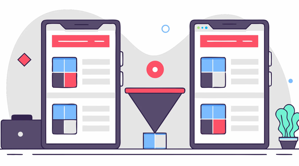
Think of A/B testing as a friendly competition for your checkout page. You create two versions of the same page, show them to different groups of shoppers, and see which one convinces more people to complete their purchase. It’s a straightforward way to let your customers’ actions tell you exactly what they prefer. By testing everything from button colors to form fields, you can make data-driven decisions that directly impact your sales, instead of relying on guesswork. This is a core part of building a high-performing checkout experience with a full suite of e-commerce features.
How does A/B testing work?
The process is simpler than it sounds. You start with your current checkout page, which we’ll call version A (the "control"). Then, you create a slightly different version, B (the "variant"). This could involve changing the text on a button, removing a form field, or adding a trust badge. You then use a testing tool to split your website traffic, showing half your visitors version A and the other half version B. The tool tracks how many people from each group complete their purchase. The version that gets more conversions is your winner, giving you a clear path to a better checkout experience.
Why A/B testing improves conversions
The main reason to A/B test is to find and fix the little roadblocks that cause customers to abandon their carts. Maybe they couldn’t find the shipping costs, felt uneasy without a security seal, or left to hunt for a discount code. Testing helps you identify these friction points and smooth them out. Even a small lift in your checkout success rate can have a huge effect on your bottom line. For example, improving your conversion rate from 50% to 60% isn't just a 10% gain; it's a significant increase in sales. This focus on continuous improvement is key to effective conversion & AOV optimization.
Shopify's Native Checkout: What It Can (and Can't) Do
Shopify's checkout is known for being reliable and user-friendly right out of the box. It’s built to convert and provides a secure experience for your customers. But as your business grows, you might find yourself hitting a ceiling. Understanding what Shopify’s native checkout can and can’t do is the first step toward building a truly optimized sales funnel that captures every possible sale. Let's look at its features, its limitations, and the common workarounds people use to push past those boundaries.
Key Shopify checkout features
Your checkout page is the final, critical step in the customer journey. It's where window shoppers become paying customers, so getting it right is essential. Shopify provides a solid foundation with a streamlined, mobile-responsive checkout process designed to minimize friction. It includes features like abandoned cart recovery emails and Shopify Payments to make transactions smooth. For many new stores, this is more than enough to secure those initial sales. The default setup is clean and trusted by millions of shoppers, which helps build confidence and reduce hesitation at the moment of purchase.
Common Shopify checkout limitations
While Shopify's checkout is a great starting point, its one-size-fits-all approach has its limits, especially when it comes to customization and testing. If you're not on a Shopify Plus plan, you can't directly edit the core checkout pages where customers enter their information, shipping, and payment details. This means you can't add custom fields or trust badges right where they matter most. More importantly, you can't natively A/B test different layouts on these pages. Shopify restricts custom code, which makes it nearly impossible to run experiments and gather data for true conversion and AOV optimization.
Popular workarounds for Shopify's checkout
So, how do ambitious store owners get around these restrictions? Some turn to complex technical solutions. One popular workaround involves using Google Tag Manager (GTM) to inject scripts that allow for A/B testing with tools like Google Optimize. However, this method requires a precise and often tricky GTM setup across every page of your store, including the protected checkout pages. These workarounds can be fragile and may break whenever Shopify updates its platform. While they offer a glimpse of what's possible, they often demand significant technical expertise, pulling your focus away from exploring more integrated e-commerce solutions.
How to Build a Sales Funnel in Shopify
Before you can start A/B testing your checkout, it helps to understand the entire customer journey. A sales funnel visualizes the path a person takes from first hearing about your brand to becoming a loyal customer. For a Shopify store, this funnel has three main stages. Each stage requires a different approach to effectively move shoppers closer to a purchase. By optimizing each step, you create a smooth path that encourages more people to complete their checkout and come back for more.
Top of Funnel: Attract the right traffic
Your first goal is to bring the right people to your store. This is the awareness stage, where potential customers are just discovering your brand. You can attract this traffic through various marketing strategies like social media ads, content marketing, or search engine optimization (SEO). Think of this as casting a wide but targeted net. You aren't trying to sell just yet; you're simply introducing your products to an audience that is likely to be interested. The key is to create compelling content and ads that grab attention and make people curious enough to click through to your Shopify store.
Middle of Funnel: Guide shoppers to checkout
Once shoppers are on your site, they enter the middle of the funnel. Here, they are considering a purchase and comparing their options. Your job is to build trust and demonstrate your expertise to help them make a decision. You can do this with detailed product descriptions, high-quality images, customer reviews, and helpful blog posts or guides. This content should answer their questions and overcome any hesitations they might have. By providing value and showing them why your product is the best choice, you build the confidence they need to add an item to their cart and proceed to checkout.
Bottom of Funnel: Convert and retain customers
This is the final and most crucial stage. The shopper has decided to buy, and your focus shifts to making the sale and encouraging future loyalty. The single most important factor here is optimizing the checkout process to be as fast and frictionless as possible. A complicated or confusing checkout is a major reason for cart abandonment. After the purchase, the funnel doesn’t just end. You can use post-purchase emails for order confirmations, shipping updates, and even follow-up offers to turn a one-time buyer into a repeat customer. This final step is all about creating a positive experience that keeps them coming back.
What Checkout Elements Should You A/B Test?
Your checkout page is full of small details that can either guide a shopper to purchase or cause them to leave. A/B testing helps you pinpoint exactly which details work best for your audience, so you can stop guessing and start making data-driven decisions. The key is to test one element at a time to get clear, actionable results. With the right approach, you can systematically refine your checkout process for better conversion and AOV optimization and a healthier bottom line. Here are the most impactful elements to start testing.
Form fields and steps
A long, complicated form is a major source of friction and a top reason for cart abandonment. Your goal should be to make the checkout process feel as quick and easy as possible. Start by reviewing your form and asking yourself if every single field is essential. Test removing optional fields, like "Company Name" or a second address line, to see if it improves completion rates. You can also experiment with the layout, such as testing a single-page checkout against a multi-step process that shows a progress bar. The idea is to find the path of least resistance for your customers.
CTA buttons
Your call-to-action (CTA) button is the final, crucial step in the sales process. Its design and wording can have a surprisingly large impact on whether a customer clicks "buy." Test different button copy to see what resonates with your audience. For example, try an action-oriented phrase like "Complete Order" against something simpler like "Pay Now." Color is another powerful variable to test. A high-contrast color that stands out from the rest of the page can draw the eye and encourage clicks. Also, consider testing the button's size and placement to ensure it’s prominent and easy to tap, especially on mobile screens.
Shipping and pricing
No one likes surprises, especially when it involves their wallet. Unexpected costs are a leading cause of abandoned carts, so transparency is your best friend. Be upfront about all costs, including shipping fees and taxes, as early as you can. You can A/B test how you present these fees to find what works best. For example, try displaying an all-inclusive final price on the first checkout page versus adding costs at the very end. You can also test different shipping offers, like a flat rate versus a free shipping threshold, to see which incentive converts more shoppers into customers.
Trust signals and social proof
Asking a customer for their credit card information requires a high level of trust. You can ease their security concerns by displaying trust signals on your checkout page. Test adding a few well-placed trust badges, such as an SSL certificate to show the connection is secure or logos of the payment methods you accept. See if placing them near the payment fields or in the footer works better. While you want to avoid clutter, you can also test adding a short customer testimonial or a product’s star rating to reinforce that the shopper is making a great decision.
Payment options
In today's market, customers expect flexibility. Offering a variety of payment methods caters to different preferences and can prevent shoppers from dropping off at the last second. Test which payment options you display most prominently. For example, see if featuring digital wallets like PayPal or Apple Pay alongside the traditional credit card form makes a difference in your conversion rate. If you sell internationally, testing which currencies are displayed by default is also a smart move. An advanced platform makes it simple to manage dynamic currency conversion and multiple payment gateways, giving you more valuable elements to test and optimize.
How to Set Up A/B Tests for Your Shopify Checkout
Ready to start testing? While Shopify has some built-in limitations on what you can change in the checkout process, don't let that stop you. With the right tools and a clear plan, you can run effective A/B tests to find out exactly what encourages your customers to complete their purchase. It’s all about making small, data-backed changes that can lead to significant improvements in your conversion rate. Let's walk through how you can get this set up for your own store.
Essential tools for testing
To test your Shopify checkout, your go-to tool will be Google Optimize. Think of it as your testing lab. It allows you to create different versions of your checkout pages and show them to different segments of your audience to see which one performs better. Since Shopify’s checkout is a bit locked down, Google Optimize is the key to making and measuring changes. You’ll also need Google Tag Manager (GTM), which works hand-in-hand with Optimize. GTM is what you’ll use to place the necessary code snippets onto your site, including the checkout pages, so that your tests can run correctly.
A step-by-step guide to setup
Getting your first test running involves a few technical steps, but they're straightforward if you take them one at a time. First, you'll install Google Tag Manager on your Shopify store. Next, you'll connect Google Optimize by adding a small code snippet through GTM. Once the tools are connected, it's time to plan your test. Use your analytics to find where shoppers drop off in your checkout funnel. Based on that data, come up with a hypothesis. For example, maybe a clearer shipping policy could reduce abandonment. Then, in Google Optimize, you’ll build a variant with that change and set your goals, like tracking transactions. Finally, launch your test and let it run for at least a week or two to gather enough data.
How to track your test results
Once your test is running, the real fun begins. You’ll be tracking key metrics like transactions and revenue to see which version of your checkout is the winner. Even a small improvement can have a huge impact on your bottom line. For example, finding a change that lifts your checkout completion rate from 50% to 60% is a massive win. As you analyze the results, you might uncover why customers were leaving in the first place. Common culprits include surprise shipping costs, a lack of trust signals, or no guest checkout option. Using a platform with robust analytics and reporting can help you dig deeper into this data and make smarter decisions for your next test.
Common A/B Testing Mistakes to Avoid
A/B testing your checkout is an exciting process. You’re taking direct action to improve your customer experience and your bottom line. But before you pop the champagne over a winning variation, it’s important to make sure your test results are actually telling you the right story. A few common slip-ups can easily lead you to the wrong conclusions, causing you to implement changes that don’t actually help, or worse, hurt your sales.
By learning to spot these pitfalls ahead of time, you can run cleaner tests and gather data you can truly trust. Let’s walk through the most frequent mistakes so you can avoid them and make every test a valuable learning opportunity.
Testing too many things at once
When you have a long list of ideas for improving your checkout, it’s tempting to try them all at once. Maybe you want to change the button color, add a trust badge, and remove a form field. The problem is, if you test all three changes together and see a lift in conversions, you have no way of knowing which change was responsible. Was it the new button color, the badge, or the shorter form? This approach makes it impossible to learn and apply insights to future tests. The key to effective A/B testing is to isolate one variable at a time. This way, you can confidently attribute any change in performance to that specific element and build a real understanding of what drives your customers to complete a purchase.
Not running tests long enough
Calling a test too early is another classic mistake. You might see one version pull ahead after a day or two and feel eager to declare a winner. However, short test durations can be misleading. Your customer behavior can vary significantly between weekdays and weekends, or even at different times of day. To get a reliable picture, you need to let your test run long enough to capture a full business cycle. A good rule of thumb is to run a test for at least one to two weeks, depending on your store’s traffic levels. This gives you enough data to smooth out daily fluctuations and ensures your results reflect the behavior of your entire audience, not just a small, early segment.
Ignoring statistical significance
This might sound technical, but the concept is simple: statistical significance is your level of confidence that the results of your test aren't due to random chance. Most A/B testing tools will calculate this for you, often showing a confidence rate of 95% or higher for a valid result. It’s crucial not to ignore this metric. A variation that’s “winning” by a small margin with low statistical significance might just be lucky. Making a business decision based on that is a gamble. Even a small, statistically significant improvement in your checkout success rate can lead to a substantial increase in sales over time, so it pays to wait for results you can trust.
Using the wrong traffic for your test
The data you collect is only as good as the audience you test it on. A common setup error is failing to include all the right pages or visitor segments in your experiment. For example, if you’re testing your Shopify checkout, you need to ensure the test runs across all relevant checkout URLs, not just a single page. This ensures you’re capturing the complete journey for every customer who enters the funnel. Properly configuring your test's targeting in your analytics and reporting tools guarantees that your results are based on a representative sample of shoppers, giving you a clear and accurate picture of the impact of your changes.
How to Analyze Your A/B Test Results
Once your A/B test is live and collecting data, the next step is to interpret the results. This is where you find out what your customers are really telling you through their actions. Analyzing the data correctly is just as important as setting up the test properly, as it will guide your next moves and shape your checkout strategy. It’s all about turning those numbers into clear, actionable insights that help you create a better experience for your shoppers and a healthier bottom line for your business.
Key metrics to watch
The most important metric to watch is your checkout completion rate, or conversion rate. Even a small increase here can have a big impact on your sales. Beyond that single number, you should look at where shoppers are dropping off in the checkout process. Are they leaving on the shipping page or the payment page? Powerful analytics and reporting tools can help you pinpoint these weak spots. Common reasons for abandonment include unexpected shipping costs, a lack of trust signals, or not having a preferred payment option available. Identifying these friction points is the first step to fixing them.
How to track payment methods and errors
Don't just track successful sales; track the failures, too. Are customers encountering payment errors? Is one payment method failing more often than others? Tools like Google Tag Manager can be configured to capture these events, giving you a clearer picture of any technical snags in your checkout. You can also see which payment options are most popular. This data is invaluable. It might show you that a certain payment gateway is causing more trouble than it's worth or that you should prominently feature a specific dynamic currency conversion option for international customers.
How to implement winning variations
Before you declare a winner, make sure you’ve let the test run long enough to get statistically significant results, which usually takes at least one to two weeks. Once you have a clear winner, it’s time to implement it permanently. But your work doesn't stop there. Use the insights from your test to brainstorm your next experiment. For example, if adding trust badges worked, what other trust signals could you test? Continuous conversion and AOV optimization is a cycle of testing, learning, and improving. Each test, win or lose, provides valuable information to fuel the next one.
More Ways to Optimize Your Shopify Checkout
A/B testing is a powerful way to fine-tune your funnel, but it works best when you’ve already got the fundamentals right. Think of these next tips as the foundation for a high-converting checkout. They address the most common points of friction that cause shoppers to leave, even when they’re just a click away from buying. By implementing these strategies, you create a smoother, more trustworthy experience for your customers. This not only helps your current A/B tests perform better but also gives you a stronger baseline for all future optimizations. It's about clearing the path of obvious obstacles before you start polishing the smaller details.
Offer guest checkout and autofill
Forcing customers to create an account before they can buy is one of the quickest ways to lose a sale. People are busy and often wary of signing up for yet another account. The solution is simple: offer a guest checkout option. Let them complete their purchase with minimal fuss. You can always invite them to create an account on the confirmation page. To make things even faster, enable address autofill. This feature helps customers fill in their shipping details with a single click, reducing typing and preventing costly address errors. It’s all about making the path to purchase as short and easy as possible.
Show all costs upfront
Have you ever filled a cart, headed to checkout, and then been shocked by a high shipping fee or unexpected tax? It’s an instant deal-breaker for most shoppers. Transparency is non-negotiable. Make sure all costs, including shipping and taxes, are clearly displayed early in the checkout process, not just on the final payment screen. This builds trust and manages expectations. For international customers, showing prices in their local currency using a tool for dynamic currency conversion can also prevent surprises and make them feel more confident about their purchase. No one likes a last-minute surprise, especially when it involves their wallet.
Optimize for mobile checkout
A significant portion of your customers are likely shopping from their phones, often while on the go. If your checkout is clunky on a small screen, you’re losing sales. A mobile-optimized checkout should load quickly and feature large buttons, simple forms, and minimal required typing. Think about the user experience: can someone easily tap through the process with one thumb? Your checkout design should be responsive, meaning it automatically adjusts to fit any screen size perfectly. Using a platform with a powerful website builder ensures your entire store, including the checkout, is built to be mobile-first from the ground up.
Recover abandoned carts
Even with a perfect checkout, some shoppers will get distracted and leave. But that doesn't mean the sale is lost forever. Setting up automated abandoned cart reminders is one of the most effective ways to bring customers back. These emails or texts gently nudge shoppers, reminding them of the items they left behind. You can even include a small discount as an extra incentive to complete the purchase. Using a platform with built-in marketing automation makes this process simple, allowing you to set up a sequence of reminders that work automatically to recover potentially lost revenue without any manual effort.
Use exit-intent popups and live chat
Sometimes, a shopper just needs a little reassurance before they commit. An exit-intent popup that appears as a customer is about to leave the page can be your last chance to save the sale. You can use it to offer a small discount, remind them of your free shipping policy, or invite them to a live chat. Adding a live chat option directly in the checkout gives customers a way to get instant answers to last-minute questions about sizing, shipping, or returns. This direct line of communication removes doubt and shows customers you’re there to help, which is a key part of effective customer service management.
When to Move Beyond Shopify's Native Checkout
Shopify provides a solid foundation for getting an ecommerce store up and running, and its native checkout is designed to be simple and effective. For many businesses, it’s the perfect starting point. But as your brand grows and your traffic increases, you might start to feel like you’re hitting a wall. The one-size-fits-all approach that worked initially can begin to limit your ability to refine the customer journey and maximize sales.
If you’re finding that your conversion goals are outpacing what the standard Shopify checkout can offer, it’s not a sign of failure. It’s a sign of success. You’ve reached a point where your business is sophisticated enough to need more control and deeper insights. Recognizing these growing pains is the first step toward building a more powerful, customized checkout funnel that can scale with your ambitions. The key is knowing what signs to look for and understanding what a more flexible solution can do for you.
Signs you've outgrown Shopify's checkout
Feeling stuck with your checkout design is a classic sign you’re ready for something more. Unless you’re on a Shopify Plus plan, you can’t customize the core checkout pages where customers enter their information, shipping, and payment details. Your creative control is limited to the "thank you" and "order status" pages, leaving the most critical part of your funnel locked down.
This inflexibility directly impacts your ability to test and improve. Because you can't inject custom code or tracking scripts into the main checkout pages, you’re blocked from running meaningful A/B tests. You’re left guessing which changes might improve conversions instead of making data-backed decisions. If you’re frustrated by these restrictions and want to optimize the user experience to reduce cart abandonment, it’s a clear signal that you’ve outgrown the native checkout.
How Checkout Champ helps you build a better funnel
This is where having the right tool makes all the difference. Instead of being limited by a rigid system, Checkout Champ gives you complete control to build a better funnel. You can finally move beyond guesswork and start making strategic improvements based on real customer behavior. The main goal is to find and fix the friction points that cause customers to leave, and our platform is built to help you do just that.
With our tools for Conversion & AOV Optimization, you can A/B test every single element of your checkout process. From the number of form fields to the wording on your CTA buttons, you have the freedom to experiment and discover what truly works for your audience. You can implement winning variations instantly without needing a developer or a costly platform upgrade, allowing you to create a seamless checkout experience that turns more shoppers into loyal customers.
Related Articles
Frequently Asked Questions
I'm not very technical. Is A/B testing something I can realistically do on my own? I completely understand this concern. While the blog post mentions tools like Google Tag Manager, which can feel a bit technical, think of it as a one-time setup. Once the tracking is in place, the real work is more creative and strategic. It’s about coming up with a hypothesis, like "A clearer call-to-action button will get more clicks," and then using a tool to test it. However, if you want to skip the technical workarounds entirely, using a platform that has A/B testing built-in gives you all the power without any of the complicated setup.
How do I know what to test first? It feels a little overwhelming. That's a great question. The best place to start is by looking at your existing data. Check your analytics to see where most people abandon their carts. Is it on the page where they enter shipping information? Or the page where they enter payment details? The biggest drop-off point is your best opportunity. Start there with a simple, single change. For example, you could test removing an optional form field or adding a security badge near the credit card form. The goal is to get one clear win to build your confidence.
What's a realistic conversion rate improvement I can expect from A/B testing? There really is no magic number, as it depends entirely on your starting point and what you test. Instead of aiming for one huge, dramatic win, I encourage you to think of it as a process of making small, steady gains. A test might give you a 2% lift, and the next one might give you 3%. These small improvements compound over time and can lead to a significant increase in your annual revenue. The goal is continuous improvement, not a single home run.
My store doesn't get a ton of traffic. Can I still run effective A/B tests? This is a really important point. A/B testing needs a certain amount of traffic to give you results you can trust in a reasonable amount of time. If your traffic is low, a test might need to run for many weeks or even months to become statistically significant. In this situation, I'd suggest focusing on the other optimization strategies first, like offering guest checkout, ensuring all costs are upfront, and recovering abandoned carts. These are proven best practices that will improve your checkout without needing a test to validate them.
Why can't I just use a Shopify app for A/B testing my checkout? Many store owners look to apps first, which makes perfect sense. The challenge is that Shopify restricts access to the core checkout pages where customers enter their shipping and payment information. This means that while an app might be able to help you test your product pages or homepage, it can't make changes to the most critical steps in your funnel. To truly test and customize the entire checkout experience, you need a solution that can provide a more flexible and controllable checkout process from start to finish.